1986
– Branding Design –
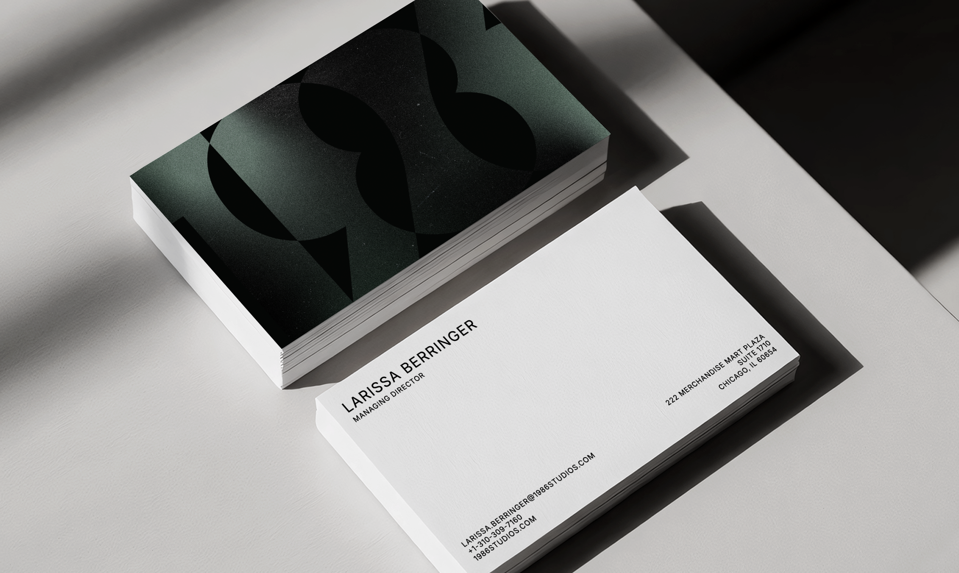
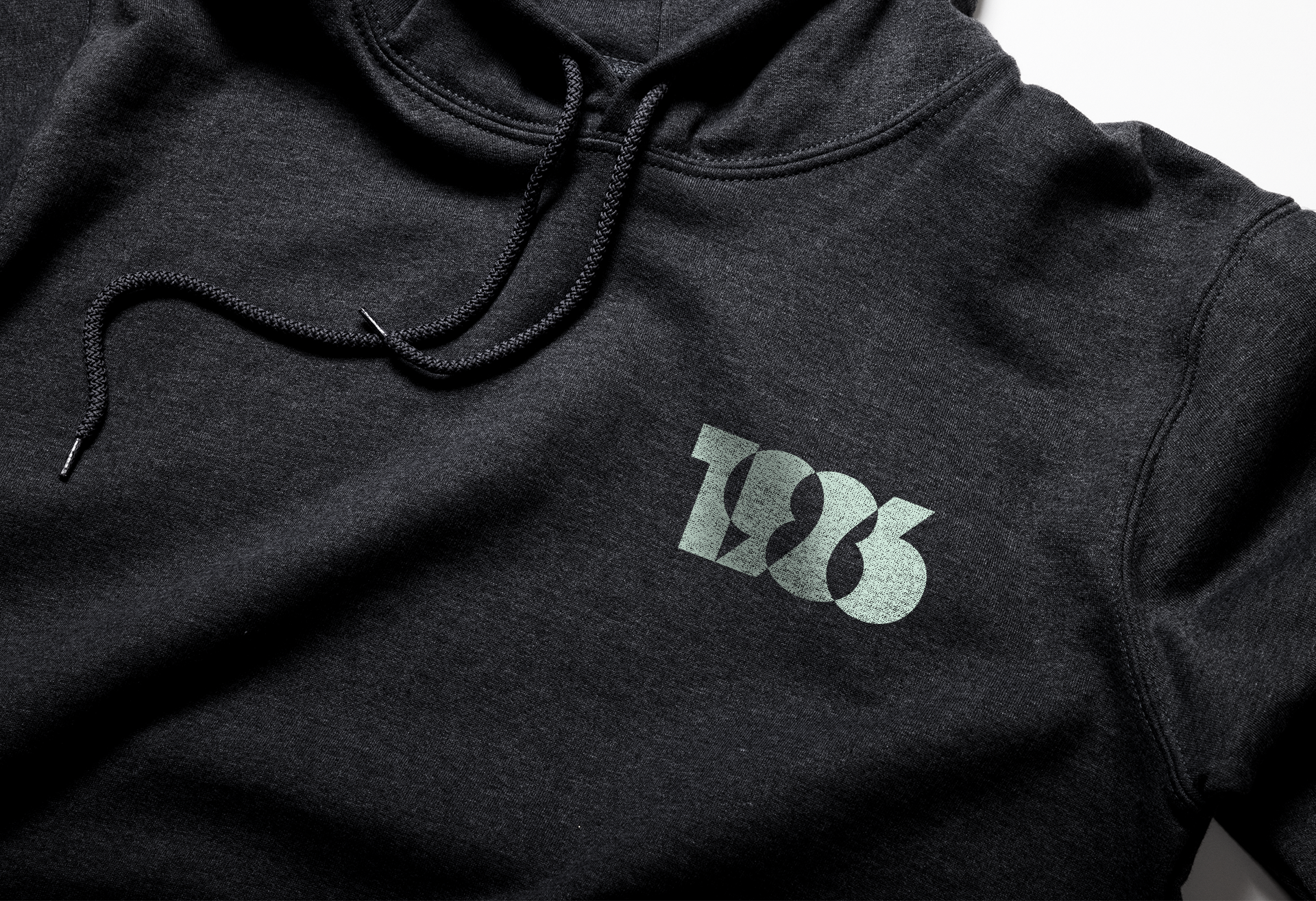
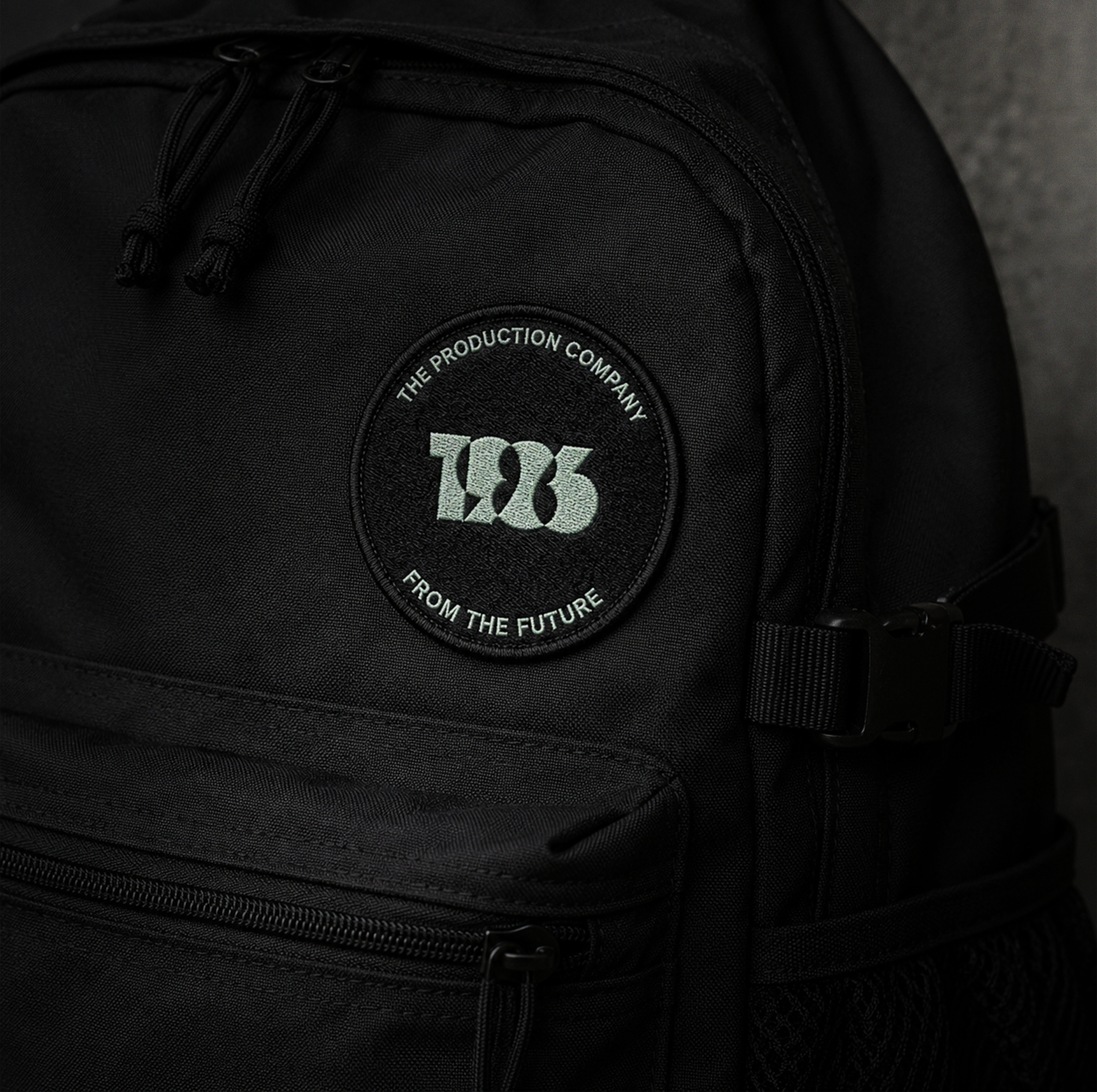
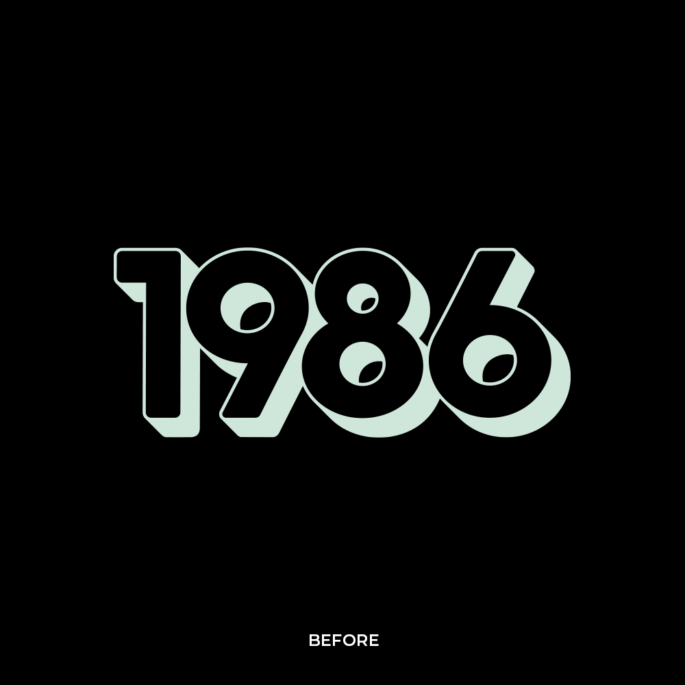
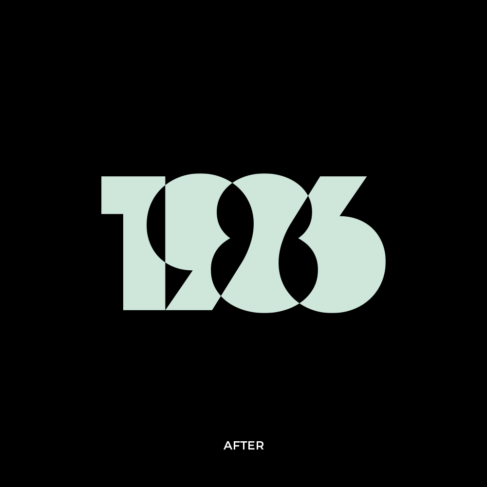
We enhanced their original logo font, kept the same color palette, and added tactile film grain gradients to highlight their detail driven craftsmanship.
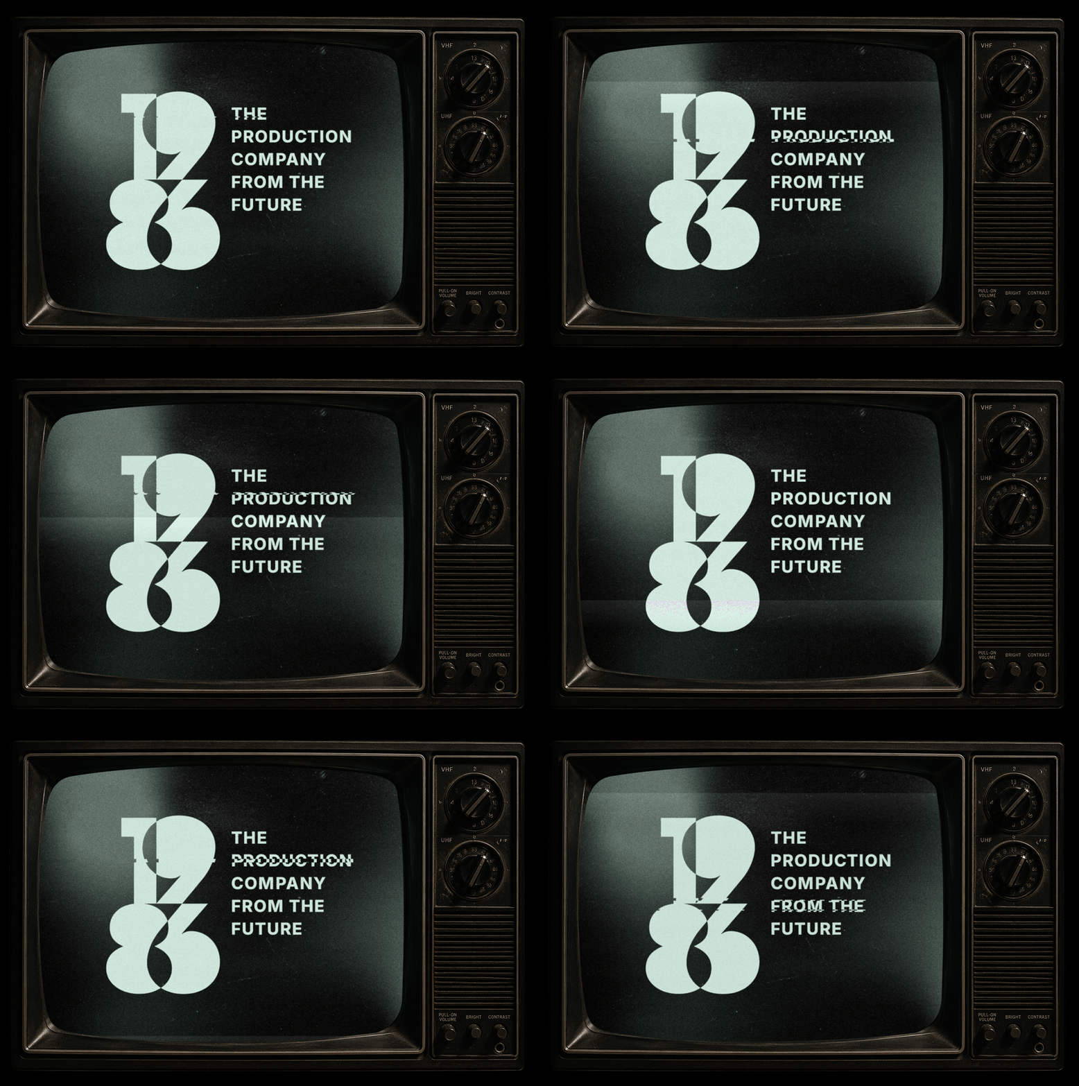
Inspiration for the refreshed 1986 brand mark was drawn from traditional film craft merged with bold, sharp lines. The overlapping number treatment references the use of film gels and the way the colors interact with each other as they move over top one another.